What Do Famous Logos tell us about Logo Design?
When thinking about logo design the most important thing to remember is that first impressions count. Your brand or business logo is usually the first point of contact for potential customers, so it needs to stand out and be instantly recognisable. Well-designed logos can become so iconic that they don’t require words to identify them: think of the Nike swoosh, McDonald’s golden arches or Apple’s bitten apple.
The best logos create a kind of visual shortcut for the brain; allowing it to perceive the basic elements of the logo, recognise it and recall previous experiences with the brand; and all in an incredible 400 milliseconds.
So, how do you create a powerful logo that people will remember? Well looking and learning from the iconic logos of the most recognisable brands on the planet is always a good place to start.
What the Apple logo tells us about Simplicity
For a company called Apple, the simplest design is, of course, an apple. However, the very simplicity of the Apple logo allows it to be incredibly adaptable and able to reflect the traits of its products in its design.
The Apple logo has changed often throughout its history, but without updating from its instantly recognisable silhouette, for example, the rainbow-coloured design that coincided with the release of their first colour display in 1977 or the current flat minimal design that looks sleek and modern like the new Apple products. The graphic simplicity of the Apple logo has made it one of the most iconic in the world.
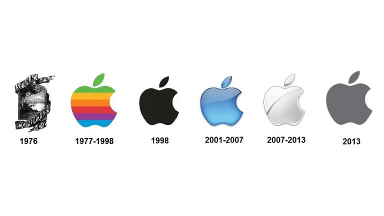
Image source: https://www.youtube.com/watch?v=wMiOUhELR3c
What the Google logo tells us about Consistency
Google’s logo was first created in 1989 and there have been several versions since the company was launched (who remembers the exclamation mark in an early iteration which, at the time, was meant to make it look more like rival Yahoo!’s logo?)
In 2015, the logo had a major redesign when the typeface was changed from serif to sans serif to give it a modern feel. Crucially, however, Google retained the core colours of blue, red, yellow and green, which maintained the consistency, and therefore recognisability, of the logo. Google also uses the same colours for all of its products, such as Gmail, Chrome and Google Docs, creating a cohesive identity across the entire brand.

Image source:http://www.delucchiplus.com/logo-redesigns/
What the Amazon logo tells us about Hidden Messages
Incorporating a little hidden message into a logo gives the audience their own little ‘light bulb’ moment when they spot it, which both offers more information about the brand and creates a sense of understanding that sticks in the mind.
The Amazon logo is strongly typographical but isn’t as simple as it seems when you take a closer look at the orange arrow below the word. It has a clever double meaning: representing a smile with the arrowhead being a stylised dimple, and starting from the ‘a’ and ending at the ‘z’, suggesting that they sell everything from A to Z. Conveying this much information with such simplicity is the hallmark of a great logo.
Image source:https://1000logos.net/amazon-logo/
What the Instagram logo tells us about Evolution
Though there was an outcry when Instagram changed their logo, there is sometimes a good argument for a radical redesign, whether it’s as part of a complete rebranding exercise or, as in Instagram’s case, the old one just wasn’t working anymore.
When Instagram first launched they chose a vintage Polaroid camera illustration which stopped representing the company as it evolved. Instagram decided that, as the app had developed from being just about posting pictures to become a broader social media platform, the logo needed to change also to reflect how – in the words of the company – “vibrant and diverse your storytelling has become”. The new logo still incorporates the rainbow, the viewfinder and the lens of the original, but in a very modern form.

Image source: https://www.imore.com/evolution-social-media-icon
What the Coca-Cola logo tells us about Timelessness
Whilst a total logo overhaul can work in some cases, there is also a lot to be said for keeping it the same, whilst design trends and fashions come and go around you. This works especially well for brands that trade on a sense of nostalgia and tradition.
Coca-Cola is a great example of this, having kept the same classic feel, with a few minor tweaks, since 1893. The sheer longevity of the logo gives the Coca-Cola brand a feeling of integrity and stability: we trust Coca-Cola because we know it will never change. It’s well known that consistent use of a logo and colours will strengthen a brand’s identity, which gives Coca-Cola a century’s worth of edge over any competition.

Image source:https://commons.wikimedia.org/wiki/File:Coca-Cola_logo.svg
What the Starbucks logo tells us about Colour
One of the biggest decisions you need to make when designing a logo is which colour, or colours, you are going to use. It may seem like a small element of your design, but the main colour of a logo has a huge effect on how it will be perceived. Research undertaken in 2006 has shown that we make subconscious judgements about a product within 90 seconds of laying our eyes on it and that between 62% and 90% of that initial assessment is based on colour alone. Colour psychology is, therefore, a crucial part of logo design, with colours influencing our thoughts, reactions and even our hormones, so it’s important to choose carefully.
Starbucks chose green, which demonstrates the traits of freshness, relaxation, environmental awareness and prosperity, all of which they want to be associated with. Green is known to have a soothing effect on human vision and is the colour that humans can see better than any other, making it easy to pick out on a busy high street.
Image source: https://www.logoworks.com/blog/siren-starbucks-logo-design/
A good logo offers the world an instant visual representation of what your brand or business stands for. They may appear simple, but a strong logo can be incredibly powerful, convincing customers to trust you and choose your company over your competitor’s. By studying other logos and learning lessons from their successes (and failures) you can create a logo that says everything about your company that you want it to, with clarity, style and simplicity.

